
HITME- RECOMMENDATIONS PLATFORM RESEARCH
Team: 5 UX designers
Duration: 10 weeks (Oct-Dec 2024)
Project: UX research, UI design
Tools: Figma, Miro,Figjam,Canva
CLIENT
Client: Joina
My role: UI designer
UX researcher
HITME is a startup company aiming to launch a new platform where you can share your favourite locations- from all over the world- to friends.THEIR PROBLEM
surveyKey insights
People like to share with friends
100% uses social media
little trust in unknown people recommending.
some examples we did to make it more understandable
updated login flowadded onboarding
re-ordered buttons to create more valuable content for new user
change UX-writing
Changed icons
added a profile page
““We had a lot of faith in the HYPER UX TEAM througout the whole process, we now have valuable insights through research that we can show to investors””

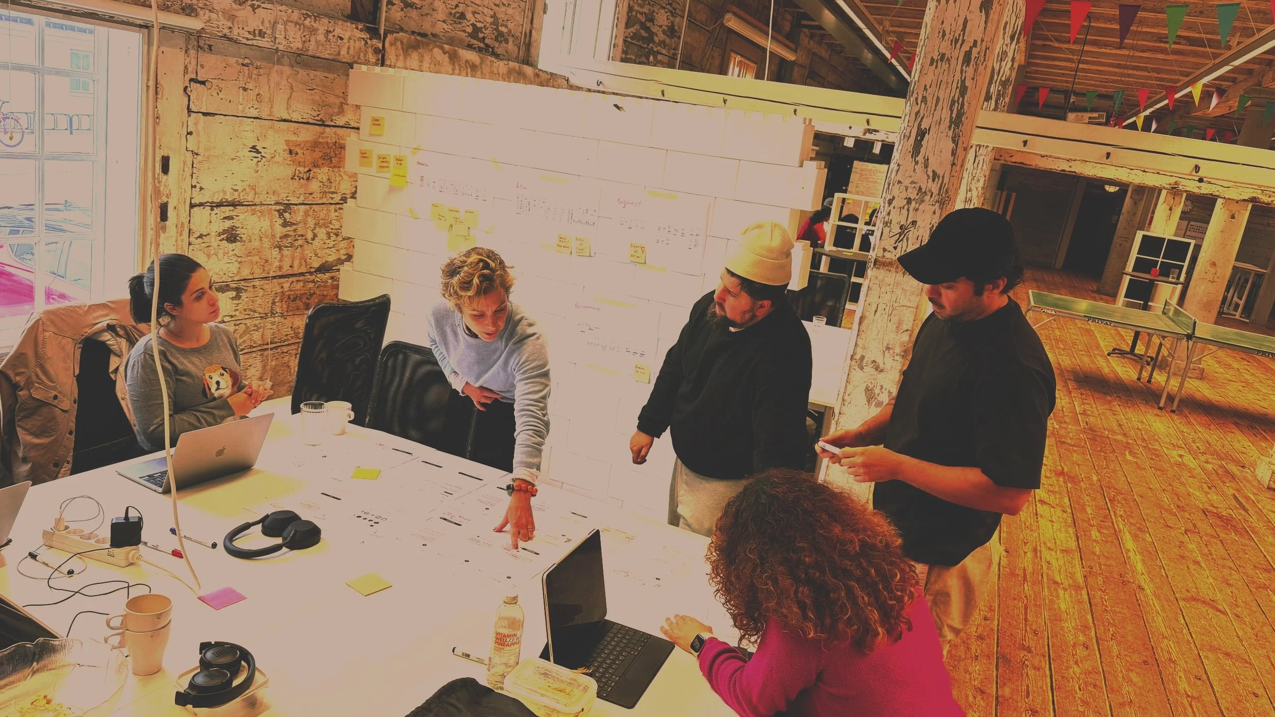
OUR PROCESS
SURVEYS AND USER TESTING
USER TEST
ITERATIONS
EXTENDED VERSION

INITIAL wireframes created- based only on assumptions - no research for design choices..
they wanted us to confirm/disproof their design choices with research
Also..
Check for best practice
understandable design?
missing features

we started with some desktop research to understand best practice for apps, and to see if we could find some missing features while recruiting for initial user testing.

40+ responses
14 in-depth interviews/user testing
In-depth interviews with user testingKey insights
Unclear UI - icons confusing
navigating task hard to understand
UX-writing not clear.

